

From the font we can tell that the style of music used in the magazine is ‘broken’ and ‘rough’ which rock music is usually associated to. The broken glass effect on the font emphasizes the ‘edginess’ and ‘rough’ style. The writing is capitalised and bold. The colour black emphasizes the boldness and makes it stand out. The way it is capitalised is as if it is coming out at you, grabbing your attention instantly.
The colour black stands out from the white background as they are effective contrasting colours making the title seem so much bolder.
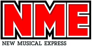
The font used tells us that the magazine is bold and different from the other music magazines. It also shows us that the audience that read this magazine are out-going, loud and are young – middle-aged age group. The title tells us that the magazine is going to be loud and bold throughout it, making the magazine seem really edgy and ‘rocky’. The title of the magazine itself is the sound of an electric guitar. This is effective because it tells us that the magazine is a music magazine.
This suggests that the target group for this magazine are young- middle aged rock music fans who are interesting in the electric style of music being shown in the magazine.

The font of this title looks as if it is old English. The style of the writing is ‘flowy’ and joint up. This suggests that the genre of music is an old English type of music that is still popular, for example rock. The title of the magazine ‘Rolling Stones’ comes from the band name The Rolling Stones- who were a popular English rock band who have been around for years and are still popular and influential. From this font we can tell that the genre of music is rock.
The colour of the title is red with a grey shadow behind it. The grey behind it makes the title look much more vibrant and bold. The first letter of the title 'R' is extended and then links to the letter 'L'. This is effective because it is almost portraying a 'guitar string' or the sound of the genre of music that the magazine is - and with the extended letter makes it seem like the sound just 'flows'. The way this is written also links with the actual word 'rolling' which is really effective. The whole title infers that the genre of music the magazine is about is 'rock' and that it is 'original' - coming from the style of font.
This suggests that the target group of this magazine are middle aged people both male and female who are interested in 'rock' music and that have grown up listening to this music and are familiar with this magazine.
From the title you cannot really tell what the genre of music is going to be but it suggests that it is going to be bold and modern due to the font. The font is bold and capitalised which suggests that the music is going to be different, bold and loud. I think it would be 'loud' because the title is as if it is screaming out to the audience and immediatly grabs your attention due to the colours and boldness. The colour red has been used to give off a modern and dramatic effect. This links into the magazine and suggests that its going to be and include bold things that stand out from other magazines. The colours have also been used to attract the target audience, and the black that outlines the red is almost like a shadow and emphasizes the boldness of the text. The font suggests that the target group are young because the title is modern.
No comments:
Post a Comment