1) This is my first title block idea. Its made by a font called 'Cutie Pop'. The reason why I used this font is because it linked with the name of magazine, its quirky and reminds of a typical teenage girls handwriting. I like this font because its curvy and smooth, rather than edgy and sharp. The font says a lot about the target audience. It shows that they are bubbly and young - this is also portrayed through the colours used, although the black against the pink gives a slight 'edgyness' to the font which is very effective and best describes the genre of music that is going to be featured in the magazine. 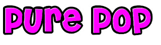
3) This font is similar to my second font but its more closer together rather than spaced out. I dont think this font is as effective than the one before as it doesnt really create the 'POP' message that i would to get through.
4) This font is quirky yet professional. I like this font because its simple but at the same time creates a 'pop' effect. The colour used is really effective as its girly, bright and vibrant which attracts the target audience. The way the text flows is very effective, as it reminds me of the type of font a magazine would use.
5) This font is the same as above but using a different colour and a shadow. the shadow and colour creates more of a dark mood with the shadow emphasizing on the darkness making it very dramatic.The font looks as if it is related to music - but not pop.. it looks as if it should
say 'hip hop'.
6) This font is very round, bright and vibrant. I dont think it fits very well with 'music' as its too formal and simple.


No comments:
Post a Comment